Designed
An exploration of editorial structure and simplicity. Built from dots, lines, and boxes, this project reimagines the foundations of design into a playful yet disciplined magazine system. It’s where layout becomes storytelling and every page learns to balance order with curiosity.
See the magazine

.png)

An exploration of editorial structure and simplicity. Built from dots, lines, and boxes, this project reimagines the foundations of design into a playful yet disciplined magazine system. It’s where layout becomes storytelling and every page learns to balance order with curiosity.
This one also started as a classroom assignment that sounded straightforward on paper: design a magazine layout using a given block of text about the principles of design. The task was to turn that content into a full editorial piece. Masthead, cover, style guide, content spreads, and everything in between.
The magazine already had a name, Designed, but what it meant visually was completely up to us.
At first, it felt like an exercise in layout, but it quickly became something deeper. This wasn’t about placing text in grids. It was about learning how editorial design actually works, how hierarchy, rhythm, and space shape the way people experience reading.
Back to the Basics
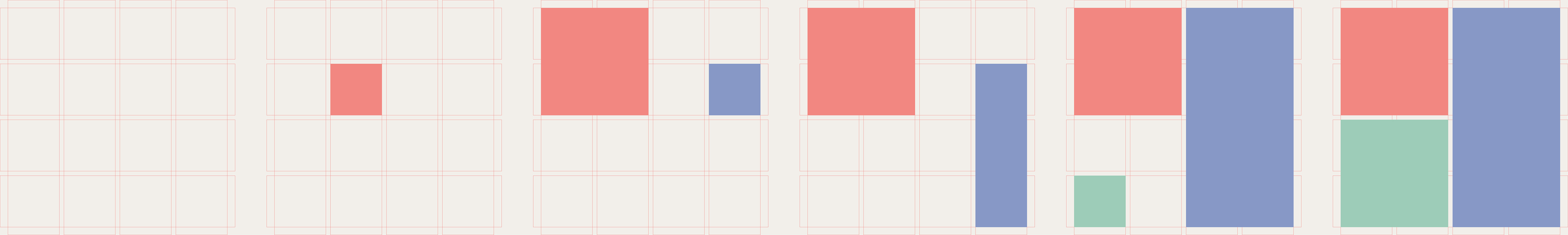
Somewhere between the initial sketches and long hours of rearranging blocks of text, the idea came together. I decided to build the entire visual system on the most fundamental elements of design: dots, lines, and boxes.
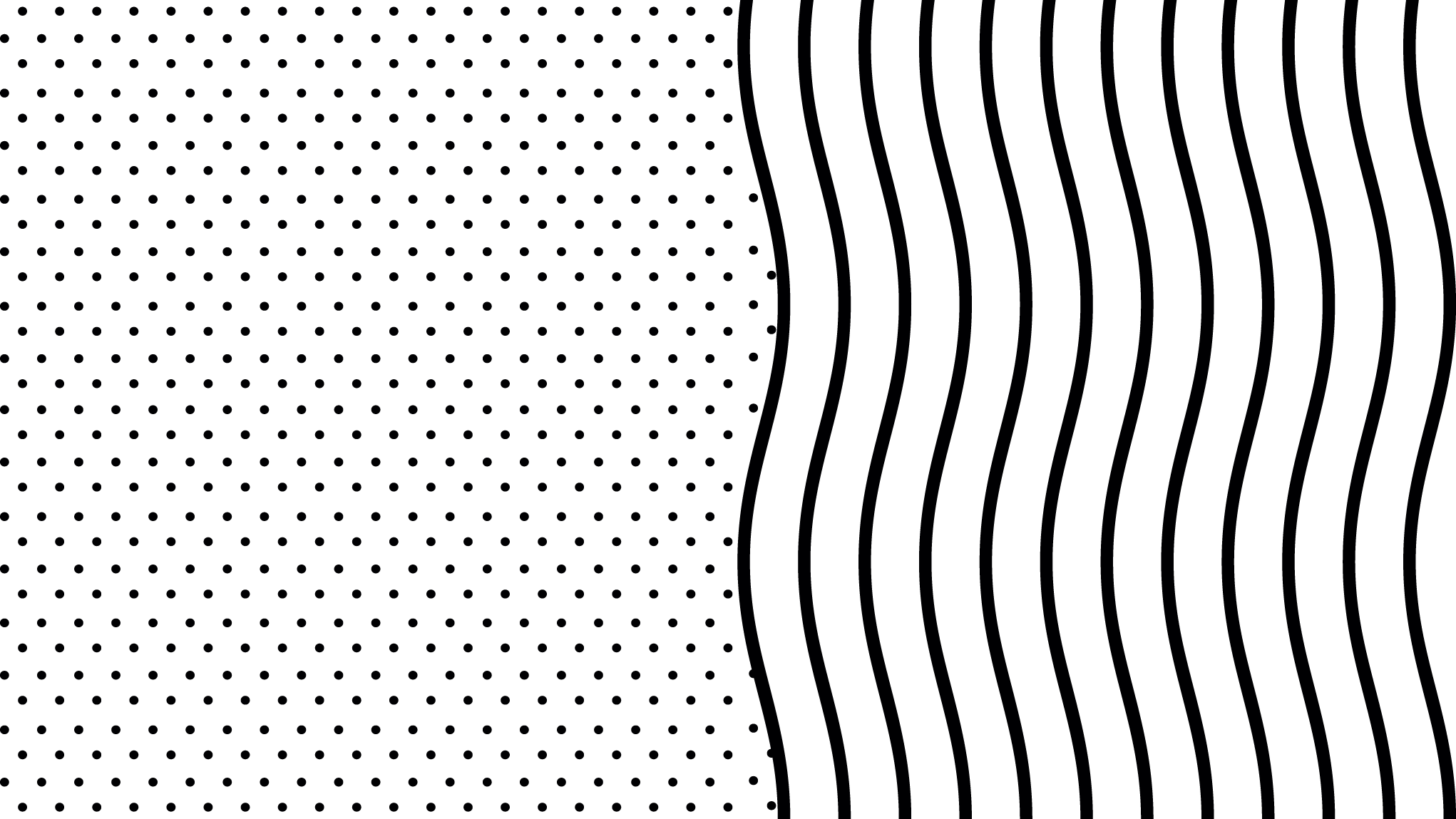
They’re the building blocks of everything we create as designers. Every shape, every composition, every idea begins here. I wanted to see how far I could go using only these elements, how much emotion and structure could come from such simplicity.
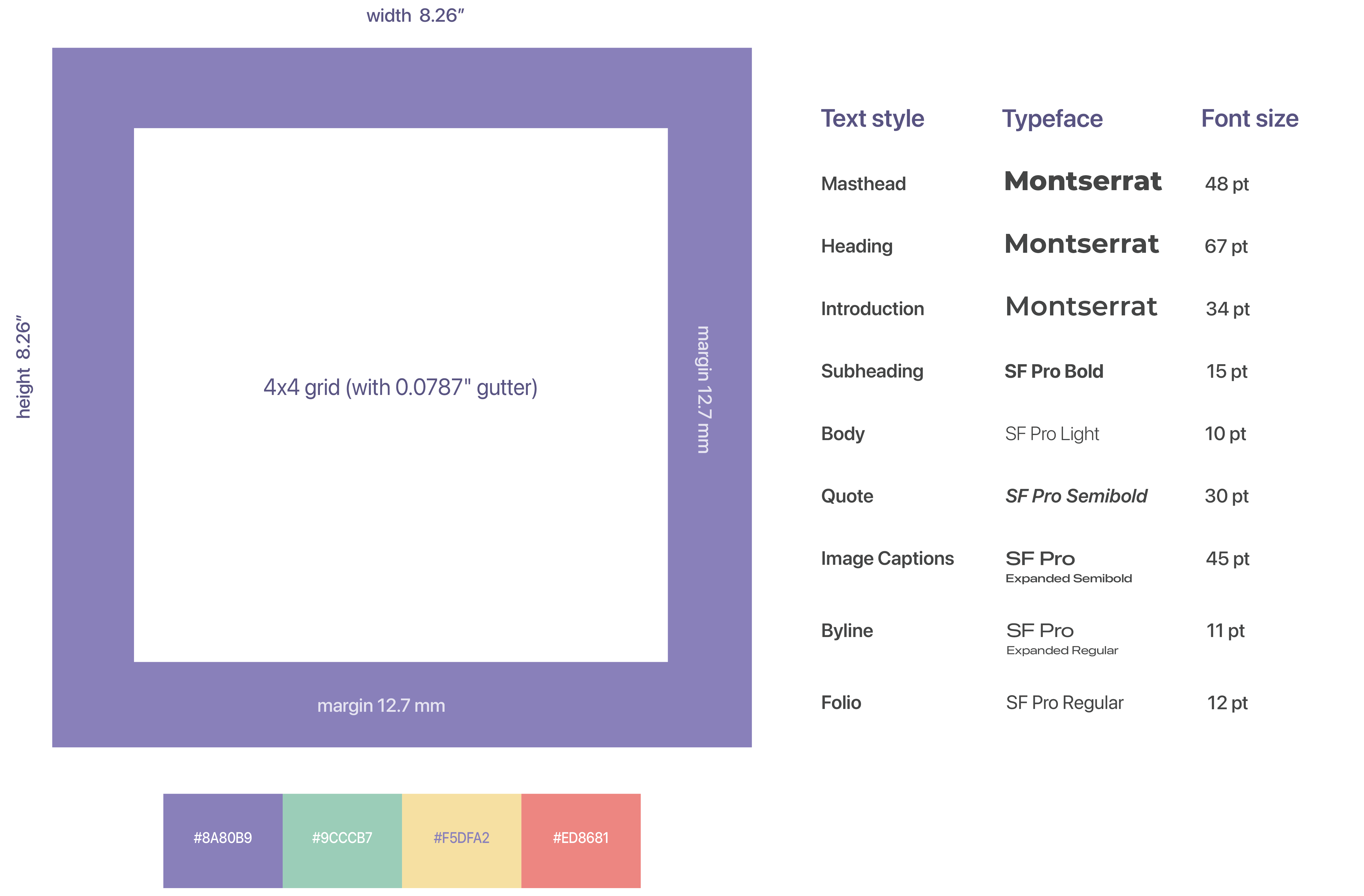
I also chose to make the magazine square instead of the usual A4. That single decision changed everything. The square format demanded a different kind of precision. It made me think harder about balance, proportion, and alignment. The pages felt more intentional, like a design object rather than just a printed layout.
Once the idea felt right, I moved to define the look and feel. I took inspiration from my college, École Intuit Lab, using its primary colors as the base palette. They were bright but balanced, giving the layouts energy that connected the design to where it was made.
Crafting the Details
Once the structure was in place, I started defining the magazine’s identity.
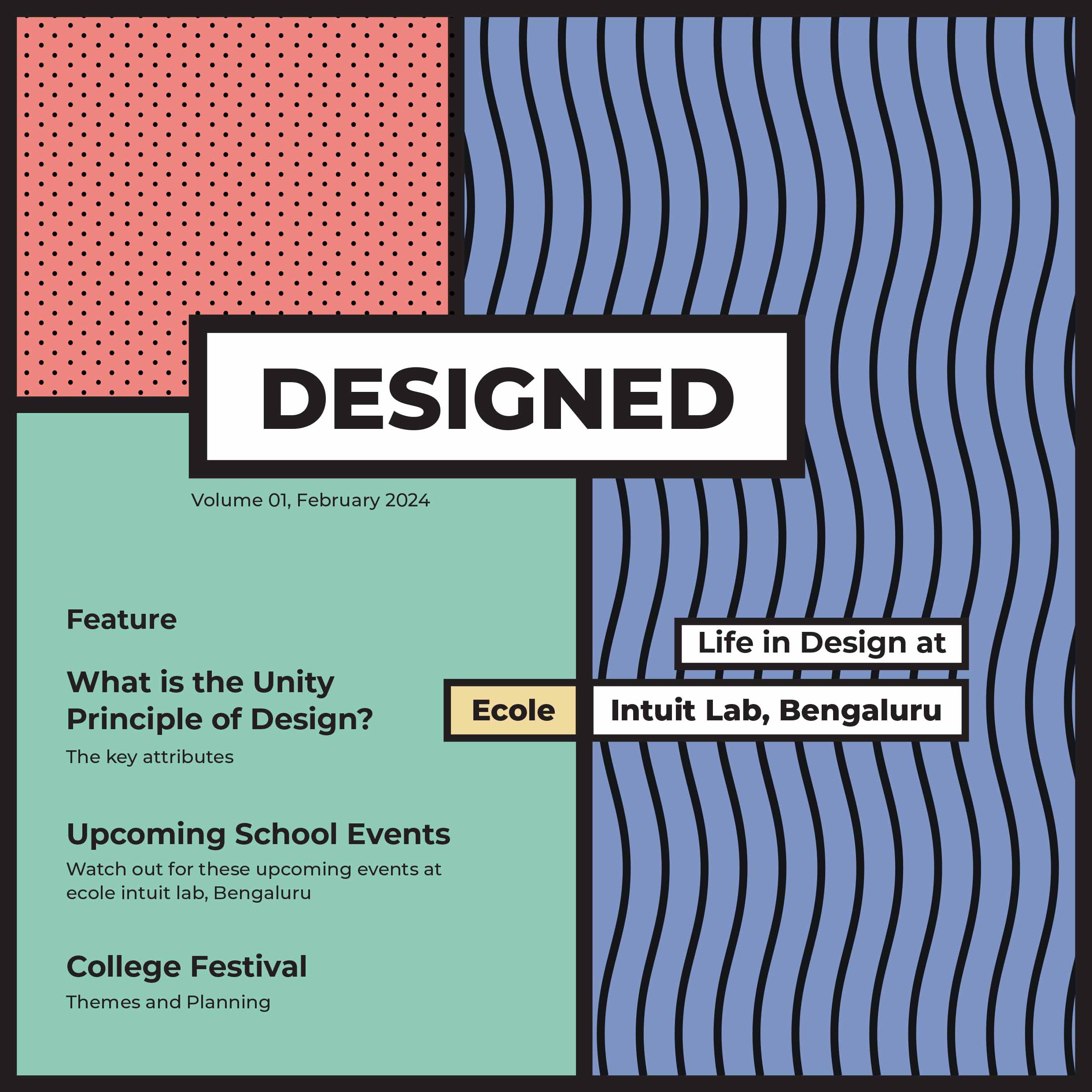
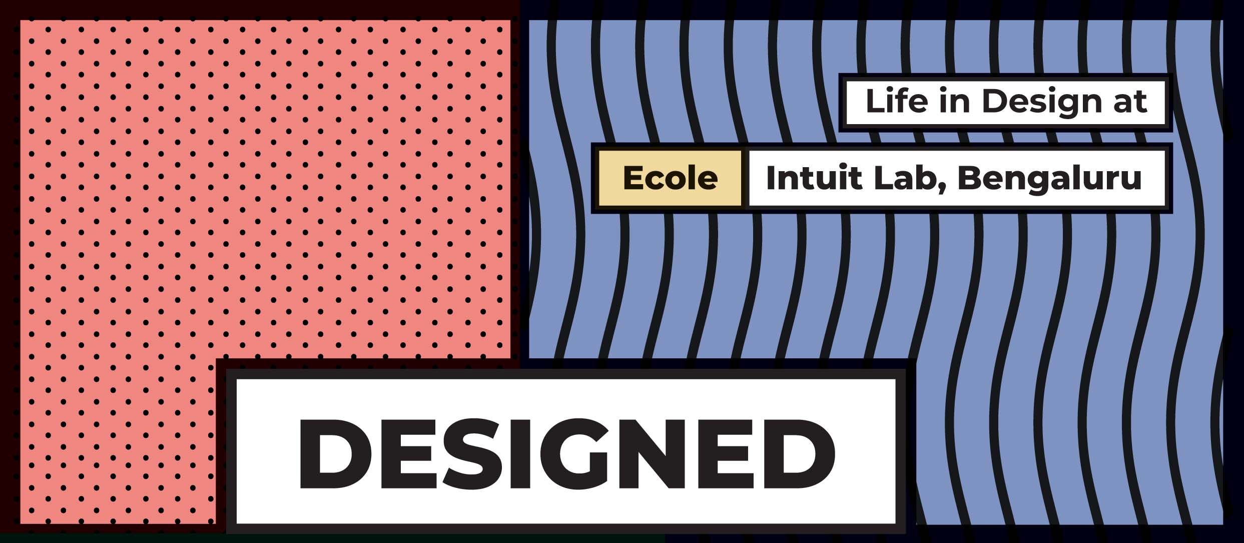
I kept the cover simple and bold. The masthead carried the presence, surrounded by layered lines and shapes that hinted at structure within play.

The layouts followed modular grids; clean yet flexible. Each page balanced structure with space, allowing the text and visuals to breathe. The small graphic accents, dots, thin lines, and geometric boxes added continuity and playfulness. It was minimal but not static.
The Outcome
The final magazine turned out exactly how I hoped. Simple, balanced, and alive. It didn’t try to show off. It just quietly expressed what design feels like when form and content move together.
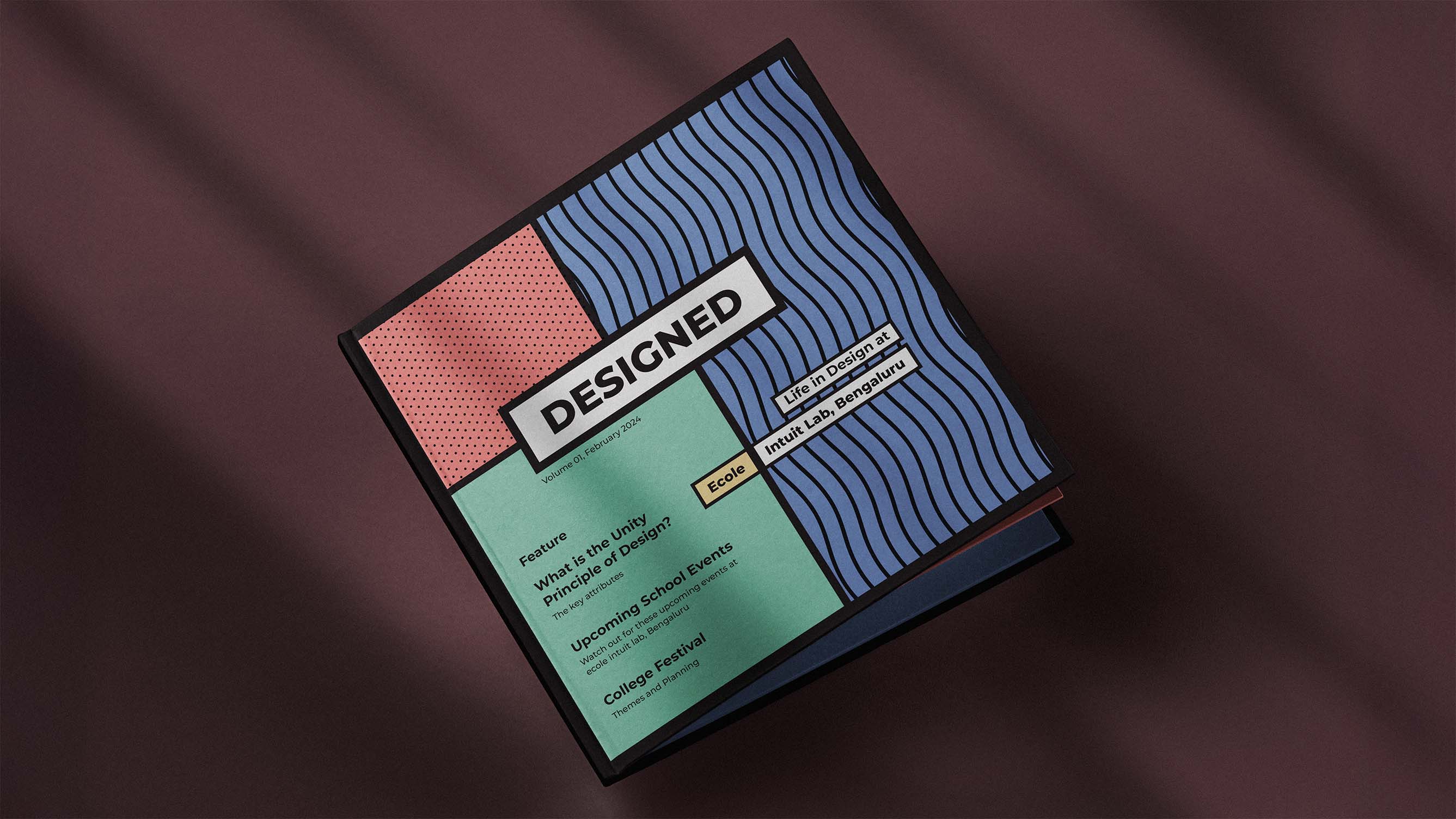
The dots, lines, and boxes did more than decorate the pages. They became a language of their own, telling the story of how structure and play coexist in design.
See the magazine
Small Reflection
Looking back, this assignment became more than a magazine exercise. It taught me how structure can be playful, and how play can still be serious. It made me appreciate how small, deliberate choices shape the way people experience content.
It was never just about making a pretty layout. It was about understanding how design principles come to life on paper. About how dots, lines, and boxes can create a quiet kind of storytelling.