Summer Greens
What happens when a 19th-century art movement meets a 21st-century fashion brand? This project reimagines Zara’s website through Impressionism — a quiet experiment in light, color, and digital restraint, where art and design meet halfway.


What happens when a 19th-century art movement meets a 21st-century fashion brand? This project reimagines Zara’s website through Impressionism — a quiet experiment in light, color, and digital restraint, where art and design meet halfway.
This one started in class. Not with a brand brief, but a quiz. A few random clicks later, I was assigned Impressionism as my design style, which honestly sounded like a polite way of saying “soft, confused, but emotional.” The goal was to reimagining Zara’s website through “Impressionism”. I didn’t know much about it, but it felt exciting to figure out this.
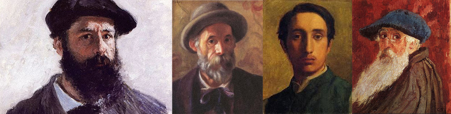
I started by diving into the movement. The art style emerged in France during the mid-to-late 19th century. Monet, Renoir, Degas, were central to Impressionism. I tried to see how they saw light, and painted as small, visible brushstrokes that convey the bare impression of form rather than detailed outlines.
The more I saw and read about Impressionism, the more it felt like the opposite of Zara.

Impressionism is textured, dreamy, and full of light. Zara is sharp, minimal, and deliberate. They shouldn’t work together, but maybe that was the fun part. My job was to let these art and design talk without yelling over each other.
So, I began with moodboards, obviously.
I put pieces of Impressionism and modern designers who have played with art in digital design. Then came sketches, grids, and too many layouts.
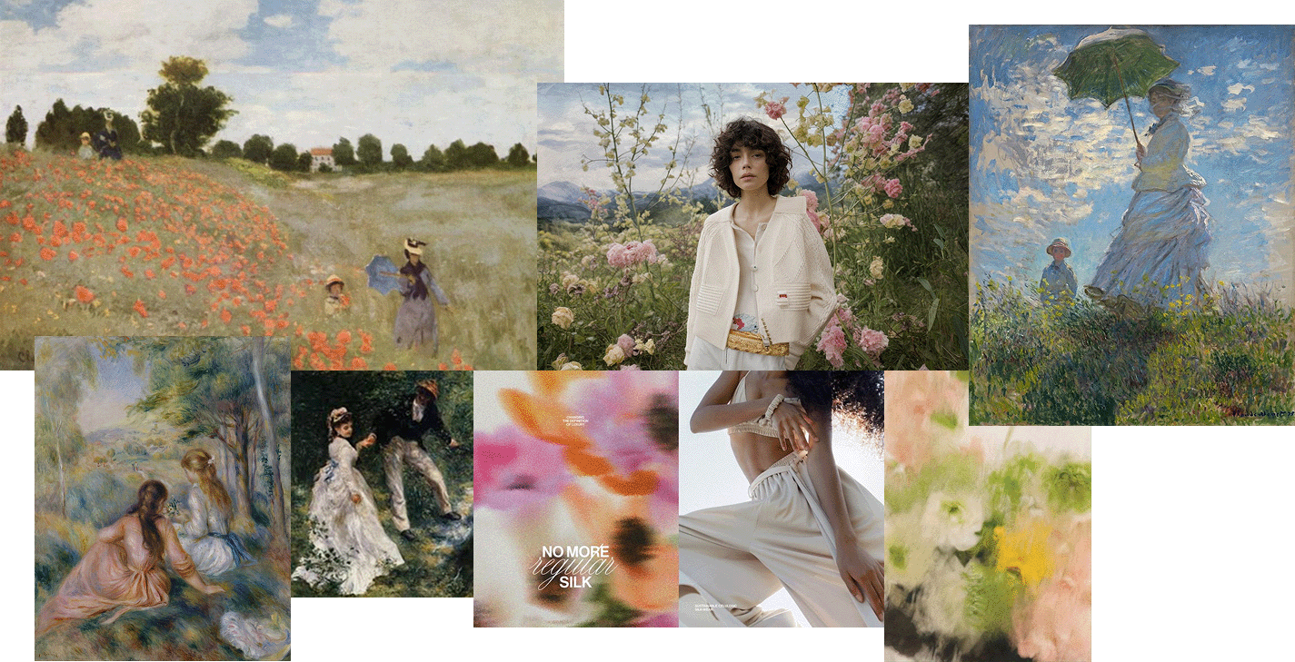
The breakthrough came when I saw a Monet-like painting of an open field with a beautiful sky and thought, what if a model is standing in the painting itself? so I layered a model in a green dress over a painting and for a moment, it looked like she belonged inside the painting only, like she had stepped out of a brushstroke. the boundary between photo and painting blurred. It looked accidental, which made it perfect.
and this became the anchor for the whole design language.
The homepage opened like a breath of summer air. soft tinge, clothes that almost melts with the painting, and colors that feel blended by light.
Then collection took the name
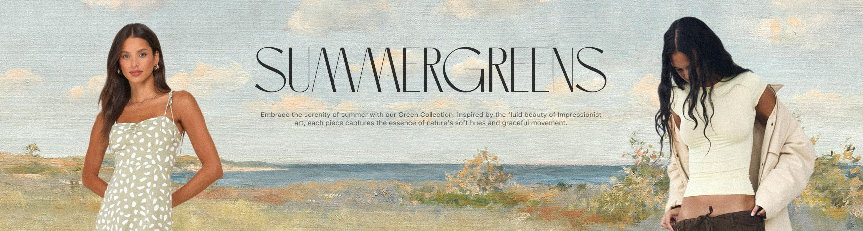
It felt natural. a mix of season, feels, tone, and the kind of quiet warmth Impressionism carries.
The collection page became a dual experience: one side for the look, other for the feeling. Models and clothes on one, abstract textures and washes on the other.
almost like the physical and emotional halves of fashion.
The product page stayed functional. a grid, clean and familiar, but I played with transparency.clothes floating above an Impressionist background. when you hover, it blurs the art, bringing focus back to design — a small irony I loved.
Shop through clean design, without losing your way in art.
In the end, it became a digital gallery that still behaved like a website. Playful, but usable. Painterly, but precise.
Small Reflection
This project made me realize how the line between art and design can be thin or thick both, depending on the person defining it.
Art moves you; design moves you in a direction.
Art can afford ambiguity; design has to make sense.
The trick is to let both exist with a right balance. Sometimes forms over functionality, sometimes other way around.Finding that balance, between how it feels and how it works, is the game I never get tired of playing.