Carson'd
A poster that started as an assignment but turned into a small creative awakening. Tried to design like David Carson, failed at it but ended up learning a lot more about myself and my style.


A poster that started as an assignment but turned into a small creative awakening. Tried to design like David Carson, failed at it but ended up learning a lot more about myself and my style.
Back when I was still figuring out where to even place a text box, my mentor gave me a challenge. We had to pick a chit with a legendary designer’s name. I got David Carson. The designer who possibly broke all the conventional design rule.
And there I was, yet to even learn the rules.
At first, I panicked. Carson was everything I wasn’t — raw, unpredictable, instinctive. I liked order, grids, systems. He liked chaos, intuition, and surfing. But that was the point...
learning to swim in someone else’s sea.
Before designing, I needed to understand the person behind the storm. Carson’s journey starts far from traditional studios.
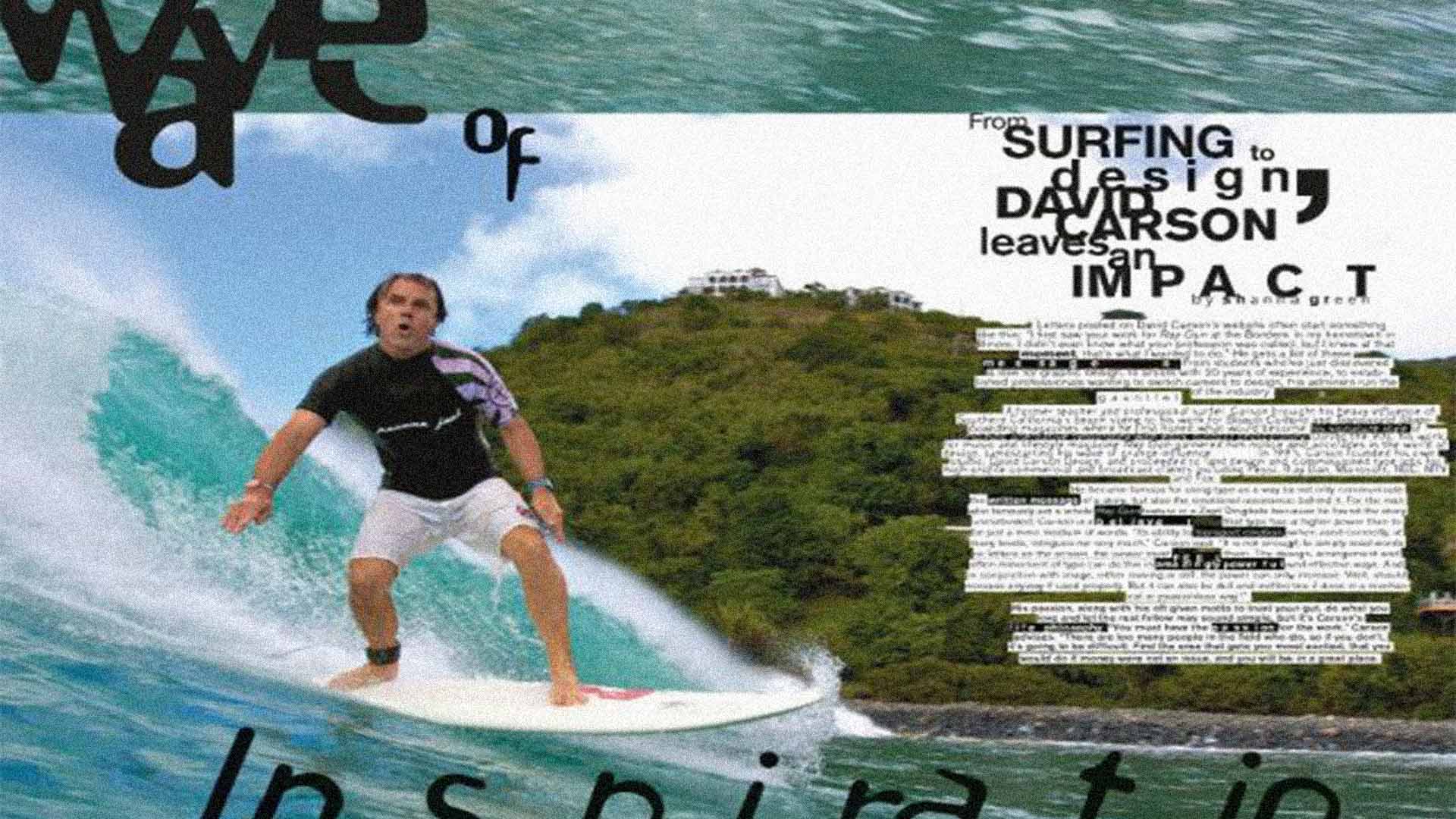
He was a surfer first, designer second. Born on September 8, 1954, Carson developed a deep connection to the visual world around him, and a love for the unconventional that would define his career.
I explored his time as art director at Ray Gun magazine, and how he turned graphic design into self-expression. What stood out was his fearless approach.

Designing by instinct rather than logic.
I absorbed his most iconic works. Ray Gun covers, Beach Culture spreads, and experimental typography where words became visual art. I watched interviews, read articles, and tried to grasp how he let emotion guide design, not rules.
It was a typography mosh pit.
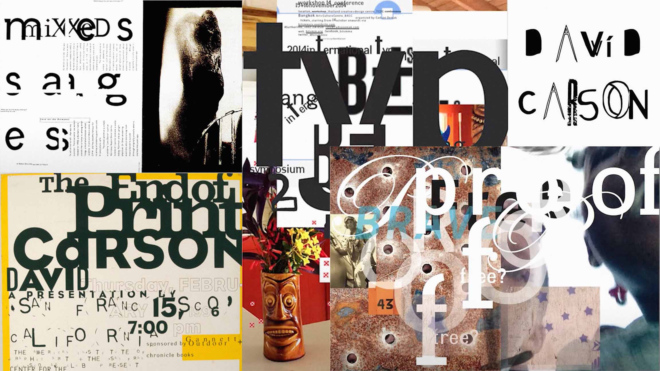
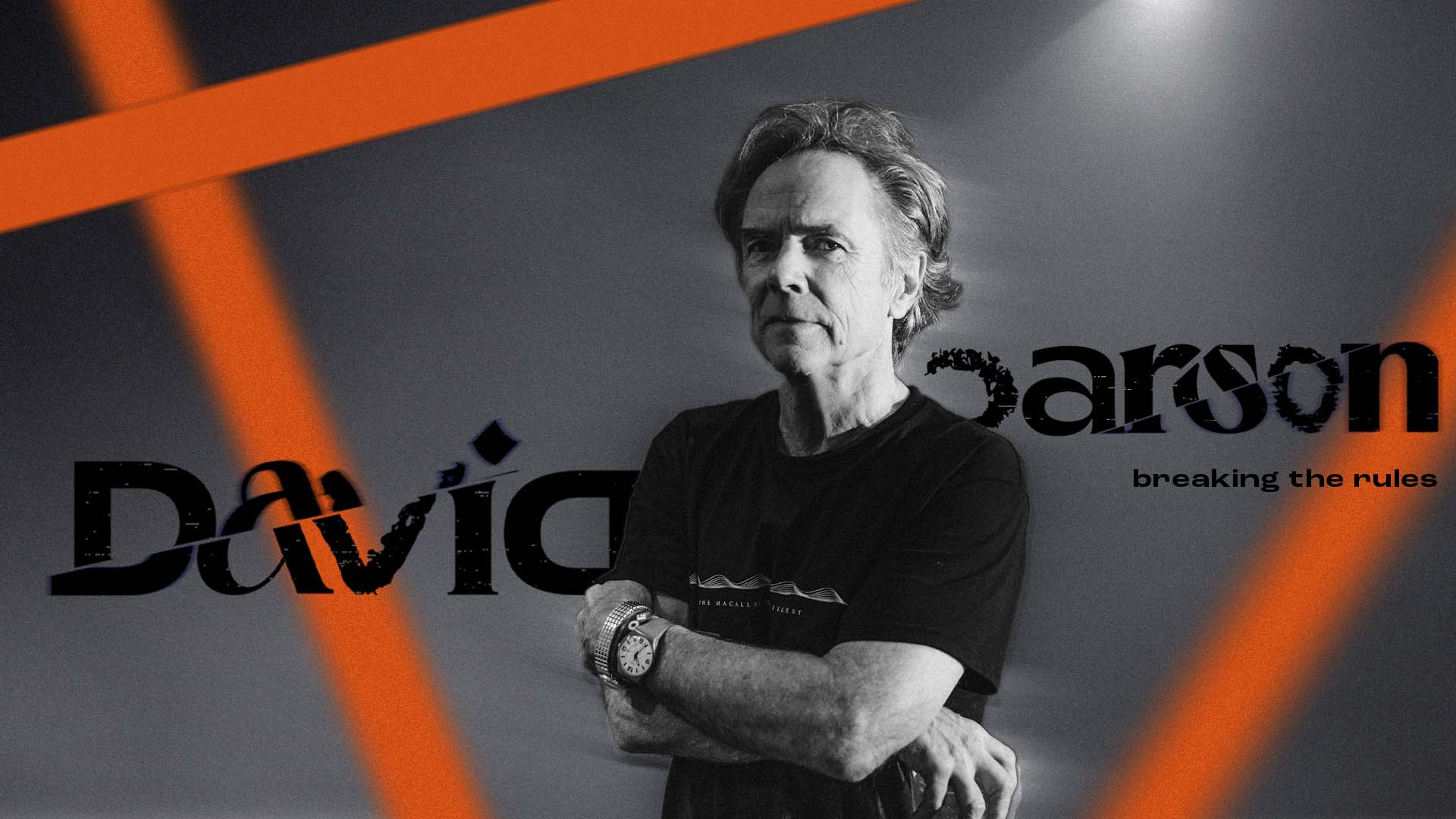
To understand Carson, I had to forget everything I knew about graphic design. Skewed letters, mixed sizes, chaotic layering. He came in like a rogue wave, surfboard under one arm and a chaotic vision in the other. Grunge typography was at the center of it all.
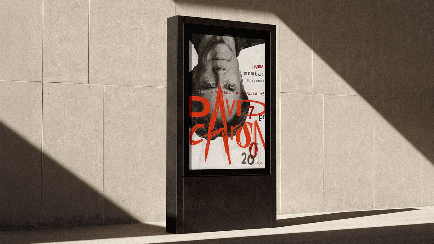
With research done, I started brainstorming for the exhibit poster. The poster had to feel something that could not be neatly boxed into a grid. I sketched layouts exploring asymmetry, layering, and unexpected visual hierarchy.
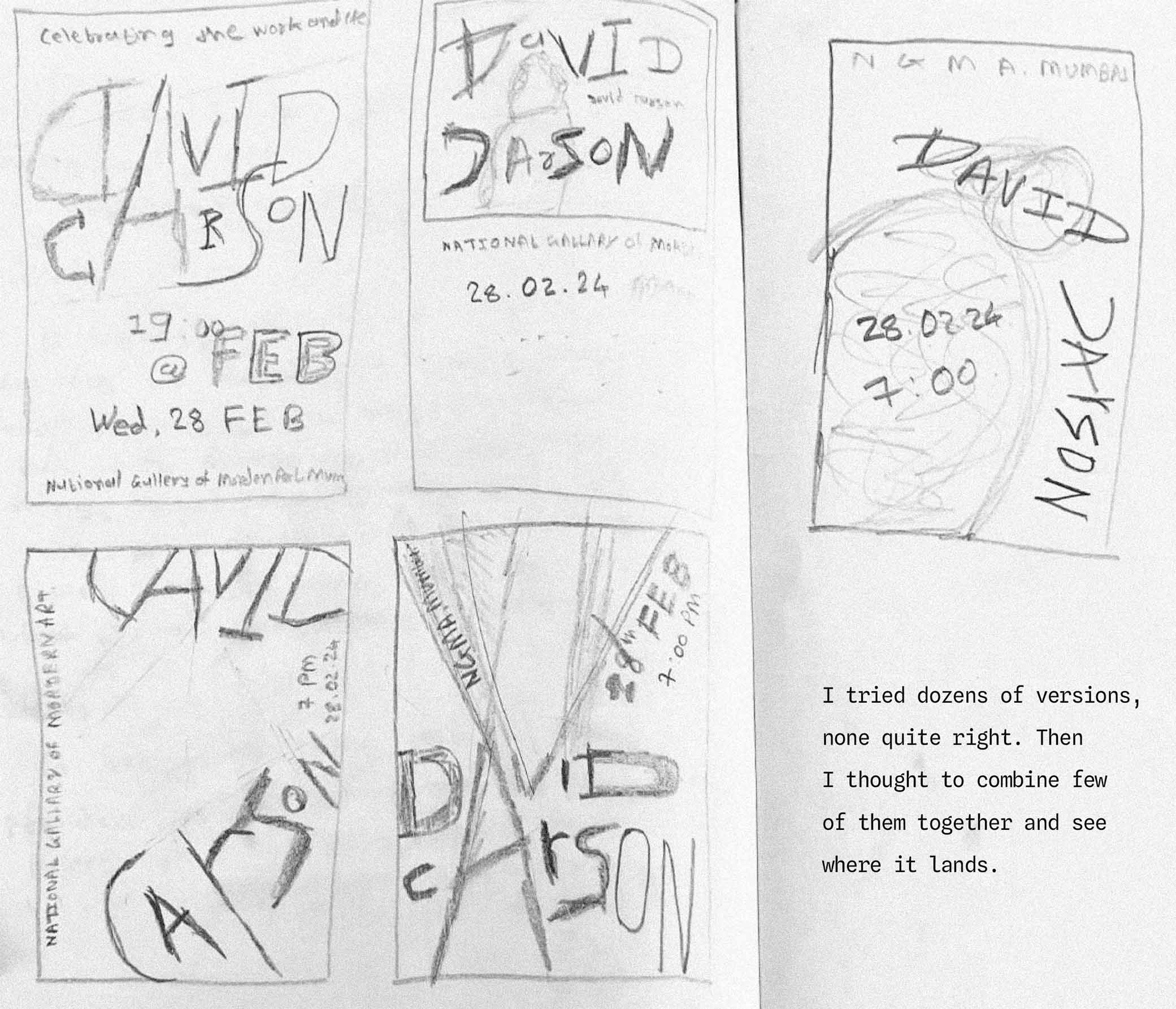
This became the starting point.
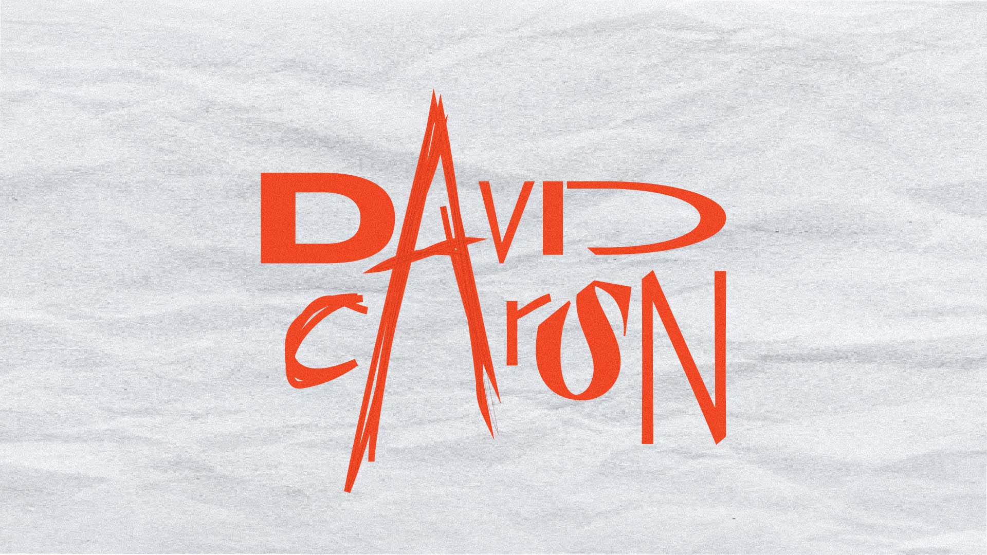
Carson often mixes typefaces, explores distortion, and embraces imperfection. I designed bold, rough, slightly underdone text, layering in the essential details like exhibit date, location, and imagery afterward.
In the digital stage, I experimented with distressed fonts, overlapping text, and unconventional spacing. Textures became key: scanned paper, torn edges, grainy overlays, adding tactile rawness. Color choices were high contrast — deep blacks, muted tones, and a bold pop of orange, reflecting the grunge aesthetic of the 1990s.
The result is chaotic, expressive, unapologetically bold. It isn’t perfect, it isn’t clean, and it wasn’t meant to be. It’s a visual mosh pit that captures both Carson’s energy and my first real taste of design freedom.
It does not perfectly match Carson’s style, but through my lens and sensibilities, it works. The faculty appreciated that I stepped out of my comfort zone and created something I could not have made intentionally in my usual style.
Small Reflection
This poster was a creative awakening. I learned that design is not just clean lines and order. Sometimes it is emotion, instinct, and imperfection. Carson taught me that rules exist to be understood, and then broken with purpose.
This poster became both a tribute to him and a personal exploration of freedom in design. It can be chaotic. It can be messy. And sometimes, that’s exactly where the magic happens.